Friday, 30 December 2011

1st Draft


Double page spread – music magazine article

The Young Gun ….

Over the next couple of weeks as the year rolls to an end James Wright will have come to the end of his first year with his new major record company Atlantic Records. Since being with Atlantic records he has scored a huge three number ones in the UK with his first and foremost debut single ‘love is not enough’.

James was born in a small country house not far from his local town of Abergavenny; his mum told us that she knew he was always going to go far even from the point where he would run around the house in his PJs singing ba-ba black sheep to himself.

Wrights non main stream career started way back in 2005 where he would record his own tracks in his small messy bedroom on some bashed up recording gear which his dad got him for his 16th birthday. By the end 2005 Wright had created his first EP ‘the lonely road’ which went on to lead to six others by July of 2006. He moved to London in 2009 aged nineteen to start playing local gigs sometimes only playing to just ten people, he played a total of 206 gigs over the one year playing three times in one day at some locations. But his big break came in the summer of 2010 where he was spotted and asked to go on tour with Just Jack; Wright commented ‘that was one of the highlights of my career and probably one of the best experiences I’ve ever had’. During the tour Wrights fan group was boosted massively all wanting to hear more of his music and so he signed his first record label with scyo music where he created his first official album ‘Spare Change’ this was very popular selling over 100,00 copies in England alone.

Over the next year James continued to make music and gigs for his fans where he was spotted by the major record company Atlantic Records who signed him up on the 14th of December 2010. After his sinning James went straight to work on his first debut track ‘love is not enough’ which when released shot up the chart selling over 7000 copies in one week. After two weeks in the charts it was number one and stayed there for an astonishing three more weeks. Later that year wright collaborated with the Kings of Leon scouring another number one, James said ‘all my life I’ve dreamed of working with big artists and working with these guys has been a mind blowing experience.’ Since this calibration Wright has focused more on his new album working in both the studio In London and LA. His new album is set to be released the 4th of January and he says he has chosen to cover some of his very first songs from when he was younger. Recently he has released his third single which has once again reached number one. Over the last year James Wright has stepped up and has put his stamp on the face of the music scene, he is currently planning on a tour towards the end of next year the dates have not been confirmed but we will know next year so keep up to date and we look forward to the new year and what it has to bring for James and other fellow artists.        

Monday, 12 December 2011

Edited Front Cover Image


This is the image which i prefered the most and think will best fit my magazine, i have removed the background using adobe photo shop and am now ready to start the magazine fronnt cover.

Possible front cover images


Sunday, 11 December 2011

possible mast heads

Using paint i have created some possible mast headsi could use in for my front cover using different fonts and colour sceems.

Wednesday, 7 December 2011

Evaluation Of My Questionaire

Questionnaire evaluation
I have created a questionnaire based on the ideas for a music magazine and have handed it out to ten members of the public to ask what they would like and would they think would make a good music magazine.
The first question I asked on my questionnaire was “What gender are you…” five out the ten where male and the other five where female, I specifically handed them out like this to get mixed feedback from both sexes. The next question I asked was “What age group are you in ….” Four where aged between 10-15 and six where aged between 16-20 this suggested to me that I would be a young adults magazine aimed at the age range of 15-20.
            The next question I asked was based on genre of the magazine I asked “What Genre of music do you like the most ….”  The most popular was Indie with 5 votes, rap with 2, pop with 2 and R&B with 1 vote. From these answers I have decided to create an Indie magazine. The next question was based on the content of the magazine I gave 6 options and the opportunity to quote any other ideas they could think of and asked them to circle their 4 favourites . The favourite 4 are as follows: up and coming artists, gig/ festival reviews, new albums/ tracks and band artist reviews. I intend to use all these ideas for my front cover and use one for my main article.
            The next question was aimed at the mast head, I asked the question “which of the following mast heads do you like the most …” again I gave the six varied options and the most popular was unplugged with 6 votes followed by beatsix with 3 and infusion with 1 from these results I have chosen to call my magazine Unplugged. The next question “Which of the following slogans do you prefer (pick 2)…” asked them to pick a slogan which would accompany the masthead. The top chosen slogans where “why we listen” followed by “let the music speak”, personally I don’t think these slogans go with the mast head so I may have to think of some other suitable ones.  
            The next couple of questions focused on the front cover. First I asked “What colours scheme should the magazine cover use (choose three)...” the most popular colours where white, red and blue which I would be happy to use on my front cover. The next question asked about the main image, I asked   What images would you like to see on the front of the magazine…..” the most popular was solo artist with 7 votes followed by bands with 4 vote, from these results I have chosen to go with an image of a solo artist.
            The last question I asked was about the price of the magazine “How much would you be willing to pay for a music magazine…” the majority of people chose the cheapest option which was predictable and because of this I have decided to price my magazine around £2.00 which is affordable for the younger readers while still making a good profit.   

Tuesday, 29 November 2011

Music Fan Profile

Ideal indie
Age - 15-30
What is an ideal indie? -  Usually a self-appointed "Musician" who thinks their taste in music is really different and unique to everyone else's, they know loads of different bands and just want to find new things/ ways to improve the music.
What he’s wearing – skinny jeans usually designer or from top shop. Either a graphic t-shirt with a catchy slogan/ picture or stripped usually white and another colour (red or blue), unlike the jeans the top is lose fitting around arms and neck. Over the top an undone hoddie with a Harrington jacket over the top. Converse damps on feet done up lose so they are comfortable
Listening to – all different types of low key unsigned bands as well as some more main stream bands like cold play and the killers.
Wants to be - sees this as a stupid question but wouldn’t mind being in his own band with a record label just doing what he loves listening to and making music.
Find him – either out with his mates or in his ‘room’ chilling to some unknown band maybe strumming his own guitar.        

Monday, 28 November 2011

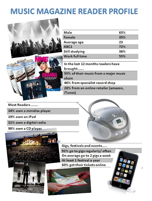
Reader Profile

Music magazine questionnaire

Music magazine questionnaire

Circle your chosen answer to the following questions

1.     What gender are you …..
Female                     
Male

2.     What age group are you in ….
10-15                                                 26-30
16-20                                                 31-35
21-25                                                 36-40

3.     What Genre of music do you like the most ….
Pop                                                     Indie
R&B                                                    Rap                            
Rock                                                   Other (please state)

4.     What 4 subjects would you most want to read about in a music magazine (pick 4) …
Up and coming artists                               Top of the charts
Gig/ festival reviews                                  Music competition
New albums tracks                                    Band/ artist reviews
Other (please state)                                                                                              

5.     which of the following mast heads t you like the most …
Labels                                    infusion
Beats                                     Back to beatsix
Vibe                                        unplugged
Beatsix                                   Louder
Other (please state)


6.     Which of the following slogans do you prefer (pick 2)………
Why we listen                                                       
let the music speak
Hear the music, feel the music, be the music
Play the music, not the instrument
It’s what we listen for
Other (please state)

7. What colours should the magazine cover be (choose three)
White                                   Black
Red                                        Blue
Pink                                       Purple
Green                                   Other (please state)

8. What images would you like to see on the front of the magazine…..
Bands or band                   solo artist
Young artist                        old artist
Other (please state)

9. Who do you think the magazine should be aimed at ….
Young generation (15 -40)
Middle aged generation (41 - 59)
Older generation (60 +)
Other (please state)

10.Would you buy a music magazine ….
Yes
No

11. How much would you be willing to pay for a music magazine…
£1.00 – 1.50
£1.50 – 2.00  
£2.00 – 2.50
£2.50 – 3.00


Saturday, 26 November 2011

Starting Points

I must think about the following aspects of my music magazine before you start planning your magazine the two main ones are …..
·      Genre of music
·      Target audience
But i must also think about…..
·      Analysing real music magazines focus on cover, contents page and articles about bands.
·      Create an imaginary band or music artist for the magazine cover, story and double page spread.
·      Create a questionnaire to carry out market research into your target audience.
·      Analyse images, bands and music artists in a range of music magazines. Identifying a particular style that you could use for your own magazine.
·      Read a range of articles in arrange of music magazines. Try to find a layout and style that you could use for my own magazine.      
What I need to think about to create an effective main image for my music magazine……
·       setting of shoot
·       location and time
·       who’s going to model
·       mise-en-scene
·       lighting
·       size of image
·       composition
·       camera angle
·       shot distance
·       background
·       genre of magazine
·       representation
·       setting – exterior or exterior
·       costume
·       props
·       pose
·       mast head position an size  
·       take at least 5 shots

Wednesday, 16 November 2011

Evaluation off school magazine front cover

Evaluation off school magazine front cover
Mast head
The mast head I chose for my school magazine was ‘KHS’ I chose this because it was the one that had most vote in my questionnaire, I think this an appropriate mast head as it is the abbreviation of the schools name and most pupils call the school by this name making it a popular and appropriate name for the school mag. When choosing a colour scheme for my magazine the most popular colours where navy and gold so when deciding the colour for my mast head I went with yellow/ gold for the writing with a thin black line running round the outside making it stand out. The mast head is positioned in the top left hand side of the page and takes up a good quarter of the page.
Image
When deciding the front covers main image I took in to account lots of factors such as who the magazine was aimed at, what aspects off school life it was going to focus on etc. Eventually I decide to use the picture I had taken of the upper school building with the new lift and windows shown in. I chose this image because it represents the school as a bright cheerful place with the blue sky in the back ground.  As my magazine is a sixth form magazine the image of the upper school building is appropriate as this is what is associated with the sixth form.
 My magazine has two subsidiary images these are a two shot close up of two rugby players and a long shot of the canteen. I think that the two subsidiary images are an appropriate size as they only take up a small amount of the page yet they are easy to see and understand. I decided to place the two subsidiary images on the bottom left hand side of the page as this seemed the best place to put them as there was only grass in the background which wasn’t important to the picture. Both subsidiary images give a clear indication on the story they are trying to tell, the two boys are both wearing rugby jerseys indicate that they play rugby and the story is going to be sport based. And the other picture of the canteen tells us about the new cafĂ© etc.

Language
Strap lines and sell lines have been used on the front cover all together I used 5 of them spreading them out all over the cover drawing in readers. The strap lines do give a clear indication on the content of the magazine they are simple and bold giving the reader knowledge of the content. I have used a few puns and alliteration in my sell lines such as ‘Sporting Success’. Looking back over my magazine I have miss spelt two words ‘success’ and ‘canteen’.
When making the magazine I made sure I used lots of different fronts and font sizes varying it for different stories and sell lines. For the colour of the sell lines I decided to stick with the black and gold varying it to create the schools colours, I think this worked well as in the background you can see the yellow and black on the school sign.
Layout and design   
The layout of my page is very simple everything is kept to the left hand side of the page primarily because that is where the space is. When taking the picture I deliberately took the photo leaving the space so that I could fit the info/ pics in.  I think that my front cover is quite appealing to the reader out of 10 I would rate it around 7, mainly because of the sell line ‘Saved by the bell’ I think made this a little big and chose the wrong colour. If I were to do it again I would make the line smaller and change it to gold colour so that more focus would be on the mast head.   
Strengths
Three aspects that I feel are good on front cover are:
·        Main image – of school
·        Having a header and footer giving extra information
·        Layout – simple and easy to follow
Targets for improvement
Three aspects that I feel need to be improved are:
·        Main sell line – ‘ saved by the bell’
·        Reposition the mast head so everything is in line
·        Another subsidiary image

Tuesday, 4 October 2011


Media studies

Questionnaire analysis

·       The first question I ask people was what year group are you in? 100% of the people said they ‘were in year’

·       Question number 2 was, do you read magazines? 70 % of the pupils said that ‘no’ they did not read magazines suggesting that not many people read magazines.

·       Question number 3 was ‘which of the following mast heads do you prefer?’ the main response was ‘khs’ followed my ‘evolve’

·       Question number 4 asked ‘what sort of pictures would you like to see on the front cover?’ the favourite chose was ‘ sixth form pictures’ followed by ‘sporting teams’

·       Question 5 was ‘what sort of colours do you associate with KHS?’ the two main colours where navy and gold I think these where the most popular because they are the colours of the school.

·       Question 6 asked which of the following ‘slogans do you prefer?’ the most popular slogan was ‘saved by the bell’ closely followed by ‘sporting successes’ 

·       Question 7 was ‘how much would you for a magazine?’ the preferred about to pay was between  50p-£1 the next chosen option was the cheapest option which was 50p

·       Question 8 was ‘circle 5 of the following stories you would like to read about ….?’ The most popular  where:

1.    Sporting stories

2.    Exam results

3.    New sixth form canteen

4.    Clubs and activities

5.    Uniform

·       Question number 9 asked ‘who do you think the magazine should be aimed at?’ the majority of people said sixth form but two people also said that it could be aimed at the year 11s and the whole school.

·       The last question I asked was ‘would you want to buy a school magazine?’ the results turned out showing that ‘yes’ most people would even though they would have to pay.